

And finally… Mastercard rebrand ditches name from logo
Mastercard’s logo will no longer feature the text of its name on its logo following a bold rebranding move.
According to reports, the restyling is inspired by the rise of digital banking and a future where there will be less reliance on card payments.
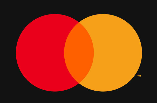
And the payments giant believes its logo of two interlocking red and orange circles is familiar enough to consumers without words, thereby putting Mastercard in the same wordless branding category as the likes of Apple and Nike.
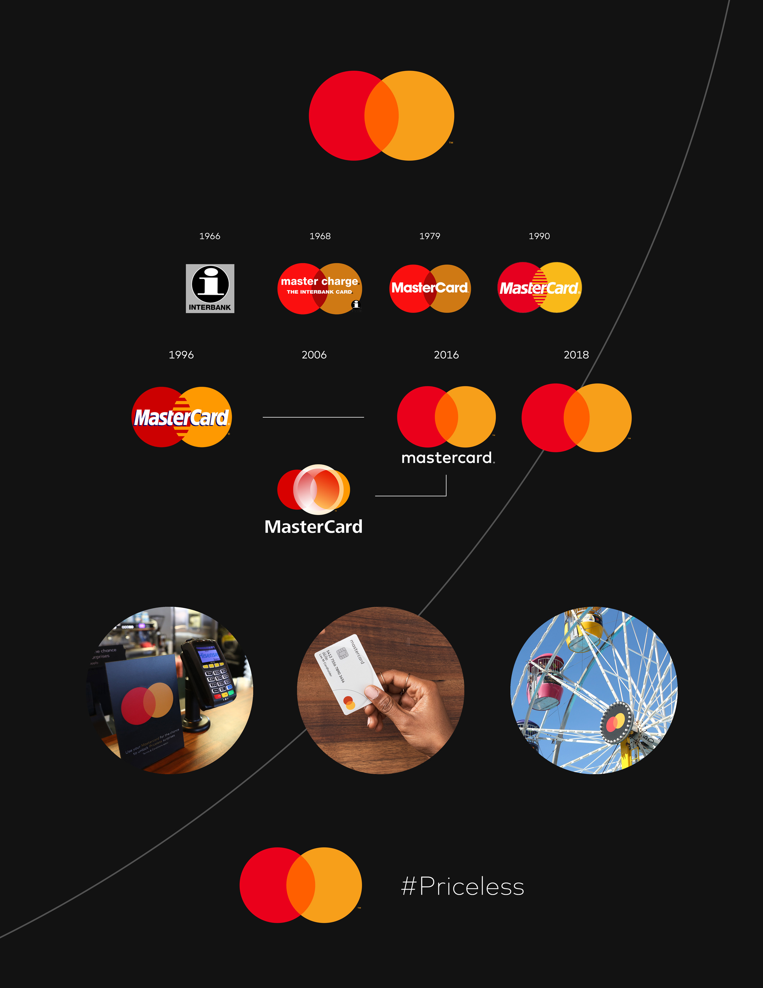
However, some have suggested that the rebrand could be an attempt to drop the word ‘card’ without actually changing the company’s name.
Speaking to the Wall Street Journal, chief marketing and communications officer Raja Rajamannar said the company was confident of the move as it comes after two years of research.
“Reinvention in the digital age calls for modern simplicity,” said Rajamannar. “And with more than 80 percent of people spontaneously recognizing the Mastercard Symbol without the word ‘mastercard,’ we felt ready to take this next step into our brand evolution.”
Michael Beirut, a partner at the design firm Pentagram, responsible for the new logo, told the WSJ that the change was also designed to make the Mastercard logo look better on smaller digital devices.